How to Create Ads That Sell – Advertising Guidelines
Now that you have selected the media, set up a schedule, and purchased your space; it is time to design ads that sell the product. This section will only review print ads, but some of the concepts (especially the persuasive format) are still applicable to other ad types.
I categorized ads into two types, ads that sell, and those that don’t–I don’t care for those that don’t. Some ad agencies justify non-selling ads by suggesting that their artsy designs help build the brand. I say, fine–“selling” ads also build the brand–in fact, they do so much quicker (if someone buys your product…poof–they’re branded!).

I also run from agencies that cite the awards they’ve won for their ads–I hire them to help me create ads that sell the product, not win awards. It is important to note that these ad awards are usually given by peers who admire the design–even though the ad may not pull a single lead. This is not to say that selling ads should not look good, but their primary purpose is to sell–either a tangible product or intangible company image (brand).
Let Marketing Guide your Ads – NOT Design!
Most designers have not taken marketing classes, they’ve taken design classes. As such, they want ads that look good, while not necessarily knowing if they will sell. On the other hand, marketing wants them to look good (and should rely on the design’s good taste), but they also need them to sell and should know what makes ads sell. I’ve never had a problem working with designers if I spend the time in the beginning to explain the effective guidelines for ads that sell
Proof Is in The Sales – Survey of Ads That Sell
I completed an advertiser’s survey for Computer Reseller News (CRN) that featured approximately 25 ads and was asked my opinion about each of them. I was appalled at most of the ads. I would rate three of them as acceptable, the rest were unacceptable—some had little chance of selling any product. Most of the larger companies used their standard ad “templates.” Unfortunately, most of these templates are flawed from the start, since they missed the elements and layout to maximize response. As a result, every division of the large companies gets saddled with an ineffective template.
Having worked at several multi-billion dollar companies, I have had to fight the political battles from trying to change the look and feel of a poorly designed ad template – to produce ads that sell. Some of the folks I had to convince were the corporate decision-makers but had absolutely no idea how to create ads that sell–instead, they would follow the advice of “the guy with the accent and bow tie” and assume everything would work.
Case Study – Ads That Sell
When I was the new Sr. VP of Marketing with a smaller public company (that was soon purchased by Motorola), I was very disappointed with the lack of leads from our existing ad campaigns. They looked nice, matched the motif of the company, but all of them combined were only pulling about 25 qualified leads per month.

I met with the existing ad agency’s management and designers, gave them my preferred “Z” format, direct response ad template and requested a re-work of our campaign. They grumbled, but the concepts I discussed made sense, so they worked creatively within the guidelines and put something together for us. Our new ad campaign pulled 35 times more leads than previously! The new ads weren’t going to win any graphics awards…but if you wanted art, you could buy a Picasso (a cheap one) with the increased revenue!
I did the same thing as a new VP of Marketing at a $130 billion Fortune 100 company. They had several ad templates and one was “almost there” (about 60%), so we stretched it to what we needed (and “forgot” to route it through the MarCom General Manager (never heard of a GM for MarCom previously)).
Not only did we increase our leads dramatically, but we also won an award from our primary publication for, “Most Leads of Any Vendor,” for the entire year. In fact, our in-house designer, who hated the format, agreed to give it a go when he realized he could still be creative even with the guidelines. He was very proud of his work and is now a diehard convert, since “his” ads pulled more leads than any previous campaign–ever (created ads that sell).
The Chanimal Print Advertising Guidelines for Ads That Sell
Throughout the years, I quickly learned that the real pros who could generate the most response from their ads (and knew the % increase in response from every element, including font, title size, number of words, color, graphic types, headings, subheads and just about anything else) were those who learned from and emulated the masters of direct response–especially direct mail. This is because direct response pros can measure the effect of everything by holding the target market segment, or any element fixed, adjusting the other variables and measuring the difference.
Many of the following guidelines were derived from the lessons I learned in this process. They have been validated with a higher response (sometimes a MUCH higher response) from my own and other campaigns.
You can register and get a PDF copy of these guidelines to pass along to your agency. There is also an Ad PowerPoint as part of the Kit available in the Chanimal Store. Below are the guidelines (without the PDF).
Chanimal Ad Guidelines
Persuasive Format
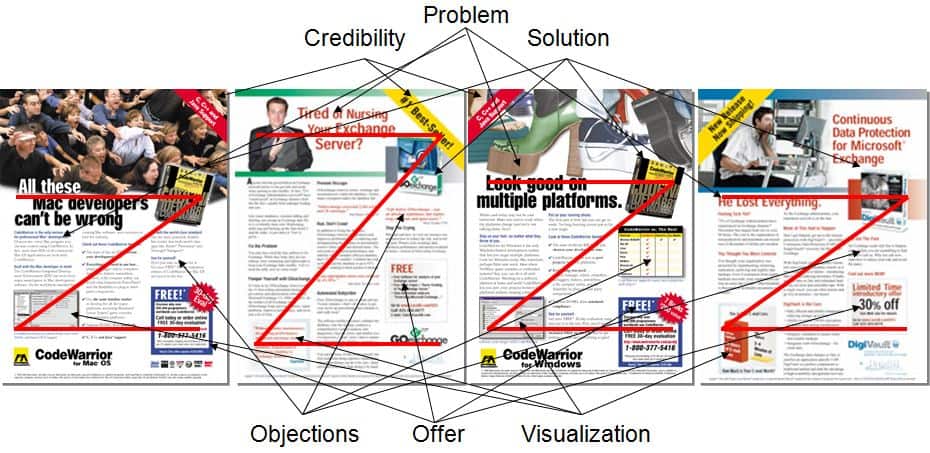
For a display ad to generate the most leads, it must be as persuasive as possible and should follow the persuasive format (Attention, Credibility, Problem, Solution, Best Solution, Overcome Objections, Visualization and Step to Actuate (close)). Using this format, I was able to increase our response by over 2 times at one company, 35 times at another (leads went from apx. 100 to over 3,500 with the same publications and same budget), and we won an award from one of our publications for “most leads” ever (while a VP of Marketing at GE). I hope these concepts help you have similar success–they have produced MILLIONS in sales.
Following is an explanation of each of these elements along with examples.
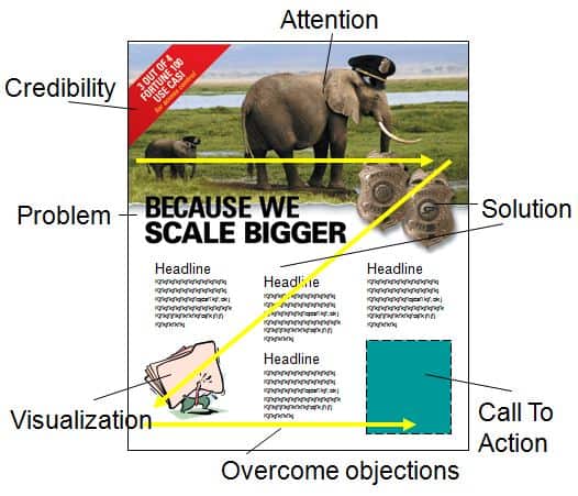
Attention
The first job of the ad is to get the reader’s attention and get them to STOP. This is achieved with a) the graphic element, b) headlines and c) the format. As with any good approach, we get attention (interest) when we establish “curiosity.” If we are curious…we will STOP and read more.
Within the ad, I recommend using a graphic and headline on the top third of the page. The acid test for the graphic: It should stand alone and represent the problem we solve, or the greatest benefit we deliver (if the problem is self-evident). The purpose is to get readers to STOP, so we can use humor (a “slight” twist on what is usually expected), a before/after scenario, the results (benefits) of our product, etc. The words NEW (since it is news) and FREE also get attention.
The headline should correlate with the graphic, as above.
The layout should follow the “Z” format so the reader can quickly scan the elements during their brief pause and determine if they want to read more. Once we catch their attention we must give them an overview quickly—which is why we follow this format.
Below are several examples that follow this approach. I’ll refer back to these examples as we cover the other sections.

Ad #1. The ad above shows a man nursing a Microsoft Exchange server (it should have had a bigger bottle and the server dressed in baby clothes—but the deadline was too short to re-work the graphic). The headline reflects the problem.
The format follows the Z format with the problem on the left, the solution (Goexchange software) on the right, visualization on the bottom left, the step to actuate on the bottom right. It seems too text-heavy, but the ad copy was clever–so once the prospect started reading, it was easy to continue. Even though rushed (“we have ad copy due today”), it produced 3 times the sales of the prior ad series. Click HERE to see the ad in detail.
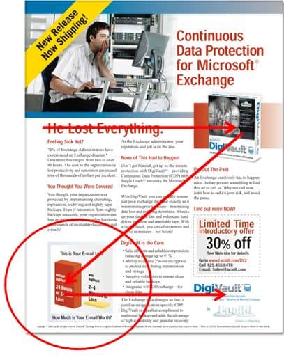
Ad #2. The ad above uses “NEW” to get attention (along with CDP (a hot category)), the headline which describes the problem is “He Lost Everything”. The graphic is believable because it is so subtle—the look of “Oh my… the company just lost over 10,000 e-mails!”
The solution is the software (on the right), the visualization is the bottom left (graph shows before/after), and the offer is on the bottom right. The prior ad pulled 1.7 times the cost ($8k ad costs–$17k sales)–this one pulled 11 times ($8k add costs–$88k sales). It was missing a few elements, including the larger first letter of the first paragraph–but was written and layout in just a few hours (the next revision improved several areas). Click HERE to see the detailed ad.
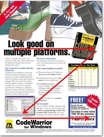
Ad #3. The primary competitive advantage of the product in the ad above was that it allowed developers to code on one platform (Windows) and easily port to another platform (Mac, Linux, Playstation, etc.). The headline gave the primary advantage with an implied problem (how do you develop on multiple platforms?), the product (solution) was on the right, the visualization was the screenshot on the bottom left and the step to actuate and offer was on the bottom right (using the Z format). Click HERE for the detailed ad.

Ad #4. The ad above shows the “Z” format. You can do likewise for each of the examples. It was for their $99 product (not the $4k product for Mac above it), hence the $20 promotional discount. Click HERE for the detailed ad.
Credibility
After we catch the reader’s attention, we need to establish credibility to add believability to our message. This is obtained through awards, a “pole” position (#1 best-seller, #1 most-award winning), quotes, our perceived expertise, and how professionally we have presented ourselves (professional doesn’t mean stuffy).
We may also include a short 7-9 word quote (3rd person testimonials are irrefutable), add additional awards. We may also have promoted the pole position within our vertical category (#1 most-award winning HVAC business management application, etc.).
We typically use a three-column layout with a 10 to 12 point type, which increases readability and we have more room to include the desired elements.
The ad does not have to win design awards (we want sales awards), but it can’t look like it was made with MS Word in-house, instead of by a professional graphic designer.
Problem
This is first demonstrated with the graphic and the headlines (either direct or implied). When the problem is evident, we can then bypass the problem and start with the solution. The problem is also mentioned in the body copy.

Ad #5. This ad was for a product that already dominated the category with a 97% market share. It was to reinforce the pole position and announce a new release—the ad was designed to get upgrades. The company had already paid for space so we had to fill it with something that would get a response. The graphic is the part I wanted to point out—it shows prospects reaching for the popular product.
I’ve also used another approach where we showed our strength within a comparative matrix. Click HERE to see the actual ad.
Solution
The solution is ALWAYS our product (period). With software, it is identified by the product package and screenshots (if they are any good—not boring). Even for download products, we create a mock-up product to turn an “intangible” into a tangible (easier to sell tangible products we can touch). We also explain how our product is the hero within the copy.
Since the package represents the hero, it should be well designed. Please download the “The Chanimal Packaging Guidelines” found at the Chanimal site (available if you register – takes 30 seconds (or you can purchase them for cheap in the Chanimal Store)). It should have a primary design element that represents the product.
Best Solution for Ads That Sell
This is developed within the body copy. The simple format is to state the problem, how our product is the solution, and then give three to five compelling and well-articulated reasons that substantiate and prove it is the BEST solution (without ever actually using the word “solution” (air, water, grease, blood—they’re all “solutions” for something—we must articulate exactly how we are the best).
For example, if we say “Increases Revenues & Profits.” We must then…PROVE IT! “
We also say,
- Increase customer loyalty
- Free up more of your time
- Reduce stress
Now we need to PROVE IT! We should make our claim, back it up, make another claim, back it up, etc. If we can’t prove it—we don’t say it (it’s just puffery and has no place in a persuasive ad). It takes more thought and homework to claim/prove, but it is much more persuasive—which is what we are after so we maximize leads.
Overcoming Objections
Once we have proven our product can help customers, we must overcome their objections (quickly so we can close). One of the most common objectives is “How does it compare” to whatever they are using, or against other known alternatives. We can go straight to the jugular with a comparative matrix (see the grid below the product picture in Ad #3).
We can also use copy like, “unlike others” or list actual product, and then state the difference. With Ad #1, the competition was the alternative–doing the work manually. We overcame this objection with the following copy:
“You can do some of this work yourself, but why waste time doing regular maintenance when Goexchange can do it for you—faster and more effectively than doing it by hand.”
We then validated this claim with a quote, “Life before Goexchange was an absolute nightmare, late nights, long weekends, and upset users.”
Visualization
The last step before the close is to help the prospect see the benefits of using the product—the “graphic” visualization goes on the bottom left corner (it’s in the scan path of the Z format), the copy uses the last sentence before the summary and close. This is done through testimonials (see Ad #1), through graphs (see Ad #2), and through screenshots (Ad #3, #4, #5), which help the user visualize using the application.
Step To Actuate – The Close
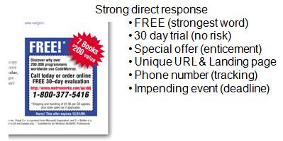
We should follow the ABC’s (always be closing) throughout the ad and within the special offer—now is not the time to blow it. We need the reader to DO SOMETHING—or else it is not a direct response ad. Following are the actions we want (any will do):
- Get the reader to our website to fill out a form (so we have a LEAD). This is where most of our responses will come from.
- Pick up the phone and call us (so we have a LEAD)
- Send us an e-mail (so we have a LEAD).
We want a LOT of highly qualified, highly interested LEADS! We have to determine what we can offer them in exchange for their contact information. What do we have that they want?
- They want product information if they are still curious
- They want something FREE. They want white papers, reports, best practice examples, resources—knowledge that will help them, regardless of whether or not they buy our product
- Promotions are good. We can use a rebate, give-away-item, bundle, etc.
- We should instill urgency to contact us with an impending event with limited time or deadline. If they are interested, they may fear missing the promotion and act now.
All of the Ad examples (1-5) above have examples of promotions, time limits, and content. Most use the word FREE (since it is the #1 most powerful marketing word (“New” is another)).
If we were able to get someone to read our ad, we must finish the job and get them to act—we cannot leave them flat and forget to close. We can provide “information” but it is too passive and not compelling enough to maximize response unless it uses this persuasive format. We need to search our bag of goodies and come up with something of value—so they will go to the website, call us, or send us an e-mail.
Tip: Within the close, we need to make sure we put a dash around the offer box. It looks like an offer (the apex of our ad) and increases the response rate.
Misc Rules You Must Follow to Produce Ads That Sell
Pay special attention to the following bullets and do not let the concise treatment distract from the value of each of these points:
- Ensure we have all the tracking mechanism’s in place. A unique URL that goes to a unique primary landing page, then a lead form, then a secondary landing page (Chanimal has examples). Also, a unique phone number (or at least a policy to ask for the source when the prospect calls).
- Corporate Logo. It helps build awareness for the institutional brand.
- Corporate Colors. Part of the brand identity. See the suggestion earlier.
- Corporate Layout. Further creates a uniform identity. We can use an existing layout from our company “if” it is persuasive. But we should lobby to change this layout if it is not. GE had four ad templates—none of them were persuasive. I was a rebel and ran an ad with my z format template. I got called on it by the branding policy, but they conceded and added a template to the GE standard ads when I proved a MUCH greater response than previous formats.
- Consistent Layout. We can change the graphic on the top 1/3rd to be the product, problem or benefit, but the rest of the layout should get laid out correctly the first time and then the format should lock (see all the ads above).
- Legal Disclaimers. The purpose of these disclaimers is to mitigate risk, not to take up all the room and distract from the ad. Without providing legal advice (my legal disclaimer), I typically put the copyright of the company and products, along with a generic, “All other copyrights are the property of their respective owners.” I push back and do not allow my legal counsel to fill the bottom 1/4th page with tons of legal disclaimers (poor IBM marketing—legal obviously presides over results (have you ever seen so much print in ads). It may mitigate all risks, but it will also reduce my space and my response—and it is my budget, not theirs.
- You versus Us. Use the word “you” (or variants) instead of we, our, us, mine—especially if we are referring to our company (creates an “us” versus “them/you” mentality). We can use “we” when we want to create an inclusive/team feeling (or do not want to blame “them” for a universal problem). Also, the copy should be personal and conversational—since the reader is alone when they are reading (you are not talking to a group).
- Headlines should sell. Five times as many people read the headlines as the body copy. Promise a benefit, provide news (increases recall). Headlines of ten words sell more than short headlines. Put your headline in quotes to increase recall over 28% (does not have to be attributed). Blind headlines decrease recall 20%. Headlines below the graphic are read 10% more than the headlines above.
- Ad size. Two page spreads often cost twice as much—but seldom pull twice the leads. Island ads (surrounded by magazine copy on the top and side) historically pull the same leads as full-page (if you can get your message across within the space)—they also offer great placement if they are surrounded by a relevant article.
- Use time and trusted words. New, FREE, introducing, etc.
- Eyes of people should look at the reader. “Photographs” of a person looking at you helps make readers stop (also works with packaging)—which is the #1 goal of any ad (get the reader to stop and notice). Now you have time to sell.
- Before & After stories help increase sales.
- Story copy. Use stories to draw readers into your copy. Avoid analogies (like) and stay away from superlatives. For example, “we are the best” actually decreases credibility (unless you can “prove it”). Testimonials increase credibility—you can’t argue with a user’s experience (3rd person selling). Celebrity testimonials increase recall—”for the celebrity,” but often decrease recall for the product.
- Long versus short copy. In a split test, long copy invariably outsells short copy—but it better be written well and be compelling enough to pull the reader through. It is better to say a “little” too much, than not enough. If it is not persuasive, not compelling, or confusing, it will not optimize a response.
- Four color. Increases recall almost 100%.
- Readability. If we want prospects to read our ad copy, we have to maximize readability. We should use the following typography rules:
- Sans font headings (catch attention, are designed to stop, and are short)
- Do not use all CAPS anywhere (headline or body copy)—it reduces readability (“retards reading”)
- Fewer than 60 characters across (including spaces). Best is 3 columns of type, 35 to 45 characters wide.
- Every photograph or screenshot has a caption (we know what the screenshot may suppose to show, but we are too close to the product. Users don’t know what to look for. It is even better if we show a screenshot with call-outs.
- Use a common typeface that is the easiest to read (Times Roman, Baskerville, etc.)—this is not the time for the creative director to show his/her stuff at the expense of readability (don’t read–don’t buy).
- Don’t hesitate to use “widows” (single lines that split into another column, etc.). They aren’t good for an English report, but short lines increase readership
- Text that is arranged in the shape of an image (star, fish, state, etc.) reduces readership
- Use leading (line-spacing) to separate paragraphs (versus indents) and it increases readership 12%
- Do not put periods at the end of headings—it creates a full stop (and we want readers to continue)
- Copy that starts with drop-initials jump-starts the reader (increases readership an avg 13%)
- Minimum 10 point type size (BTW – for websites, it should be 16-18 point–with the higher res monitors)
- Serif fonts for body copy (since they are easier to read) – sans for headlines (only for printed text–always use Sans for web copy–screen resolution is not as high as print and it slows down reading)
- The centered text should be limited to two lines
- Non-justified margins
- Paragraphs should contain no more than 6 lines (there are some exceptions when using narrower columns). Short sentences and short paragraphs increase readership (don’t confuse it with short vs. long copy).
- Never use reverse text (lighter on dark). The only exception is when the magazine requires that you slug the ad with the word “advertisement” (if it looks too much like an article). In this case, use italic caps, Sans text, in reverse—then nobody can read it ;-)
I highly recommend the book, “Ogilvy on Advertising” for the internal ad person. Within it we see examples showing the % increase in responses and sales according to each change in each design element (some of these concepts are summarized above—read chapter 7 for more) to produce ads that sell.
I also recommend that you copy whatever is working from other people’s ads. Designers often value creativity over copying—even when we have a chance to copy what works best (which should be the starting place—then branch out to see if it can be improved).
We should leverage our competition’s efforts and follow the “first to be second” rule with product and ads—first, match what is working, then anti-up and make it better. Examples include Lexus, Microsoft (seldom on the “bleeding” edge, but usually wait to see if a market has merit before they dive in), Japanese and Chinese knock-offs (so long as they don’t violate the law, their approach is wise).
Ad Concept Process – 10 Steps to Create Ads That Sell
Following is the 10 step process I typically use to create ads (simplified):
- Determine the target audience (young programmers, advanced IT within Fortune 100 companies, singing teachers, a small business with 50 – 200 employees, etc.).
- Understand the positioning of the product (how is it different)—this is the apex of all strategy and one of the most difficult areas to define. Download the Positioning PowerPoint within Chanimal or watch the Chanimal Positioning Video for more details.
- Learn the key benefits that resonate with the prospective targets. Have you asked your customers why they purchased it?
- Start copy with a simple outline on a blank page, starting with a) attention, b) credibility, c) problem, d) solution, e) best solution (prove it), f) overcoming objections, g) visualization, h) step to actuate.
- I then fill in each section with the information I have available, not worrying about the copy – just bullets and thoughts
- Theme the ad. How will the ad catch attention? Is there a theme I can use? If you could actually read the copy in the small ads above, you would see that the copy follows the theme. For example, with the “Tired of Nursing Your Exchange Server” the copy included phrases like, “given birth, improper feeding, and care, sour, stink, your “product’ baby, tried milk—now try some meat, pamper yourself, run…don’t crawl, automated babysitter, stop the crying, etc.
- Decide what your promotions/offer will be. Do not take this lightly—this is one of the most critical steps to get a response.
- Fill in the blanks with conversational copy and then route it.
- Now it is time to send the designer these guidelines so they can ad the graphic and set up the layout (make it look good) and still create a persuasive ad.
- Done. Time to print and sell some products!
I hope these guidelines helped.
Additional Resources
- AMF Shoe Ad (PDF). Shows persuasive format – aggressive competitive matrix (13.7 x return)
- Research – Typography – What works (PDF). From Ivan Levison (recommend you subscribe), an incredible copywriter that I have subscribed to for over 20 years.